Project Goal
To transform Amazon’s data-heavy checkout screen into a user-centric, streamlined interface. The objective was to eliminate visual clutter and cognitive friction, ensuring that users can finalize their purchases with speed, clarity, and confidence, ultimately driving higher conversion rates for mobile shoppers.
Disclaimer: This is a concept project created for educational and portfolio purposes. I am not affiliated with, or endorsed by, Amazon.com, Inc.
UX Solutions & Key Features
1) Information Architecture (IA) & Cognitive Load
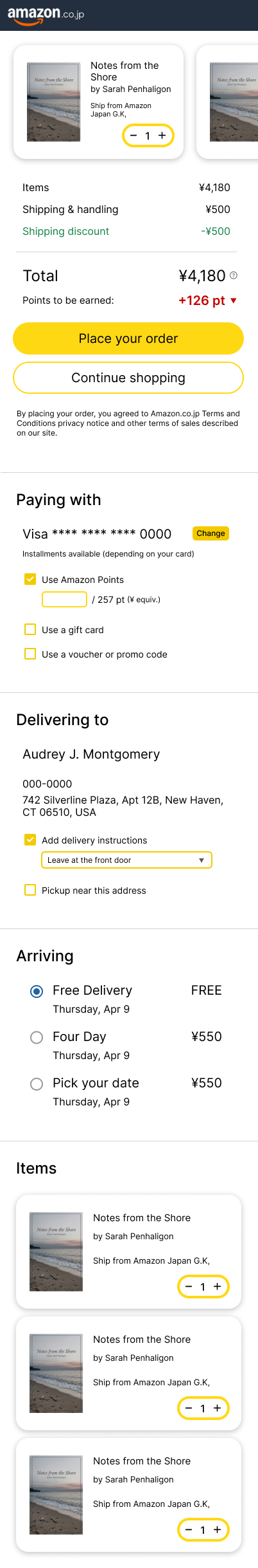
The original screen suffered from information overload, mixing legal disclaimers, promotional banners (Prime Video), and essential checkout data. I restructured the layout into logical, high-contrast sections—Payment, Delivering to, and Arriving. This grouping allows users to scan the page and verify their details in seconds, significantly reducing the cognitive effort required to move toward the final step.
2) Visual Hierarchy & Conversion Rate Optimization
In the redesign, I prioritized the “Order Total” and the “Place Your Order” CTA by moving them to the top-of-the-fold. By using a high-visibility yellow and clearing the surrounding visual noise, I created a clear path to purchase. This ensures that the user’s primary intent—buying the product—is never overshadowed by secondary information like advertisements.
3) Touch Target & Mobile Accessibility
Following Fitts’s Law, I expanded the spacing between interactive elements and enlarged the touch targets (buttons and selectors). The redesign ensures that users can comfortably operate the interface with one hand. By eliminating “fat-finger” errors—such as accidentally clicking the wrong delivery date—I created a friction-free experience that caters to users on the go.
4) Micro-Copy & Trust Signals
Enhanced Trust Signals through Content Clarity
I replaced the dense, legalistic text at the top with a clean, item-focused summary. By bringing the product thumbnails into a more visible, organized layout, users get immediate visual confirmation of their purchase. Providing clear feedback on points earned and shipping discounts acts as a positive reinforcement, building trust right before the final commitment.
5) Design System & Scalability – The Engineering Perspective
Beyond aesthetics, this redesign utilizes a component-based system. Every element, f is designed as a reusable component. This ensures that the design is not only visually consistent but also implementation-ready, allowing developers to translate these UI patterns into code with minimal overhead and maximum scalability.
Before
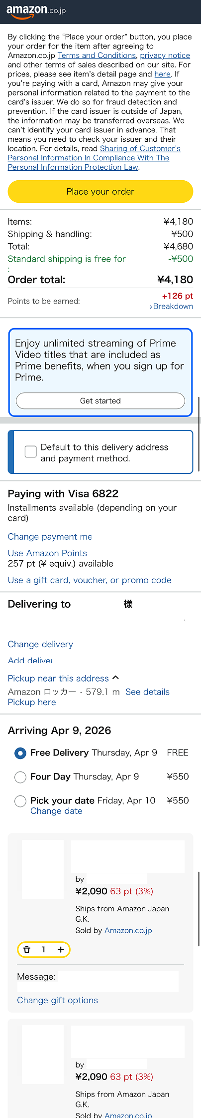
After