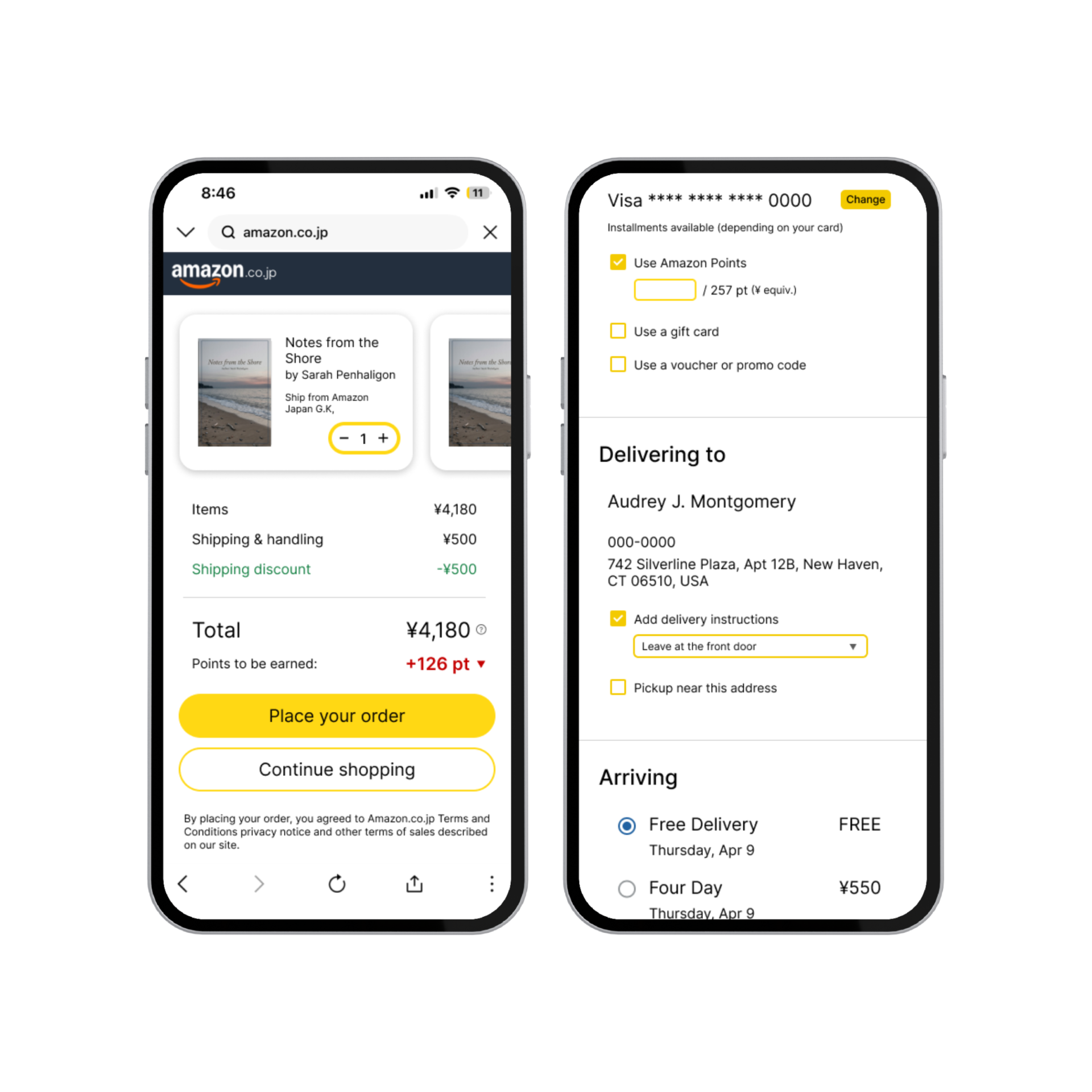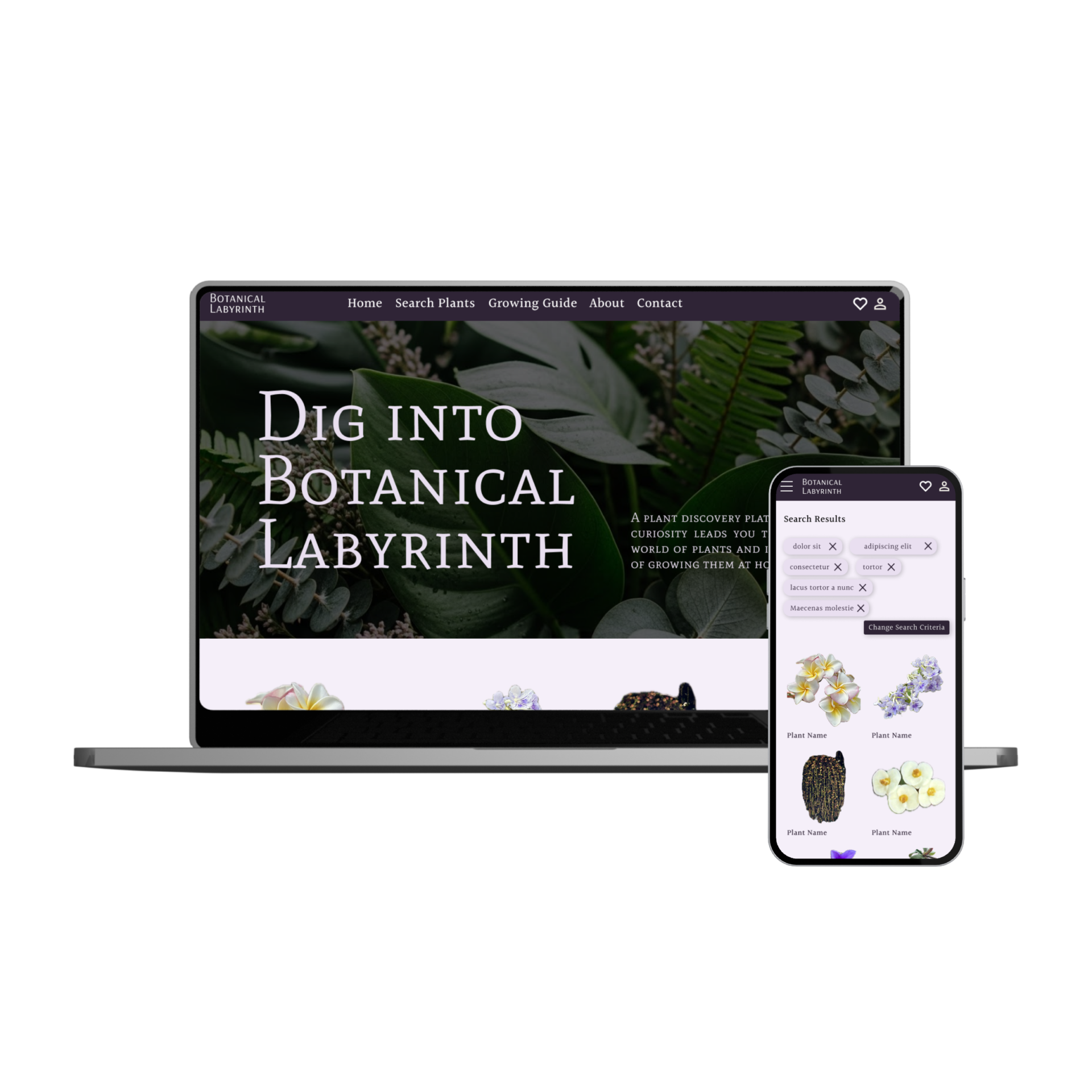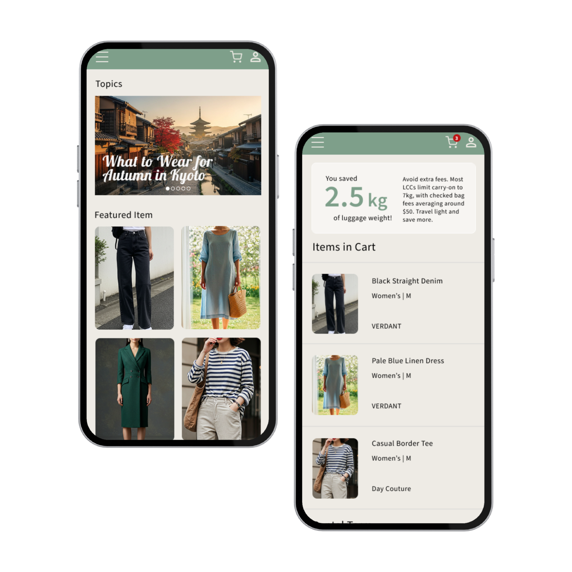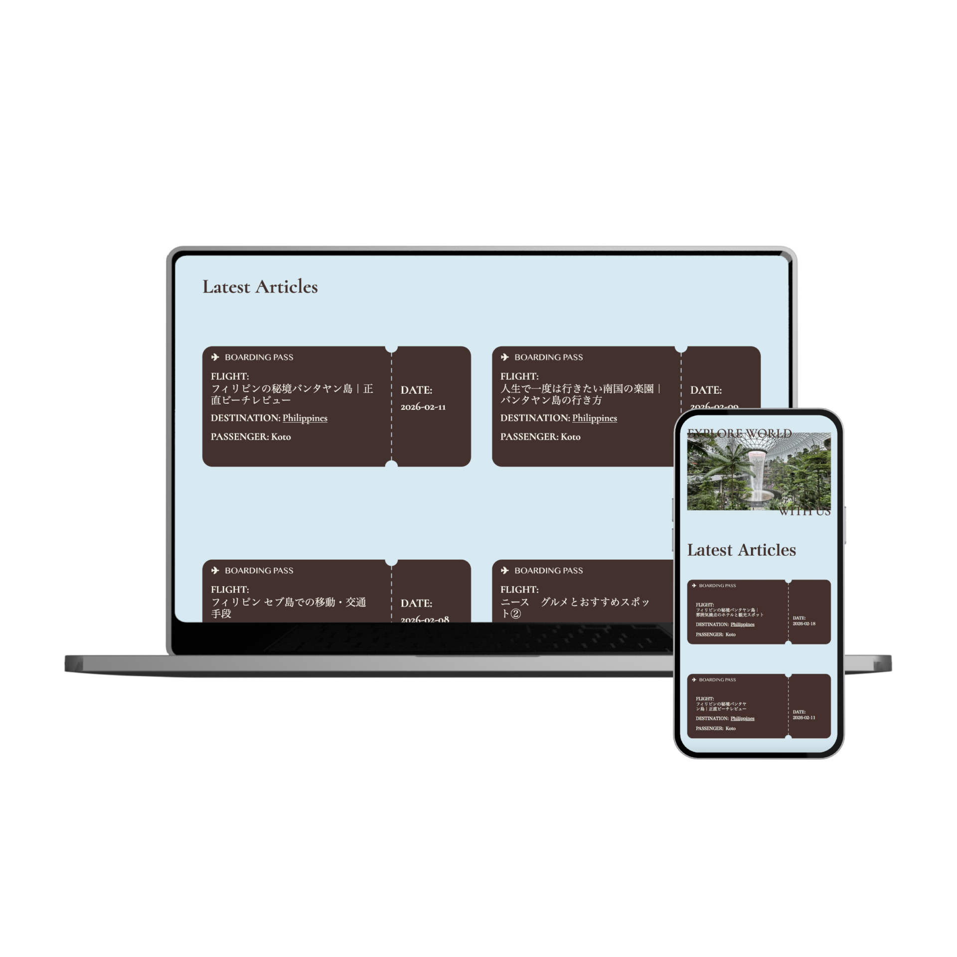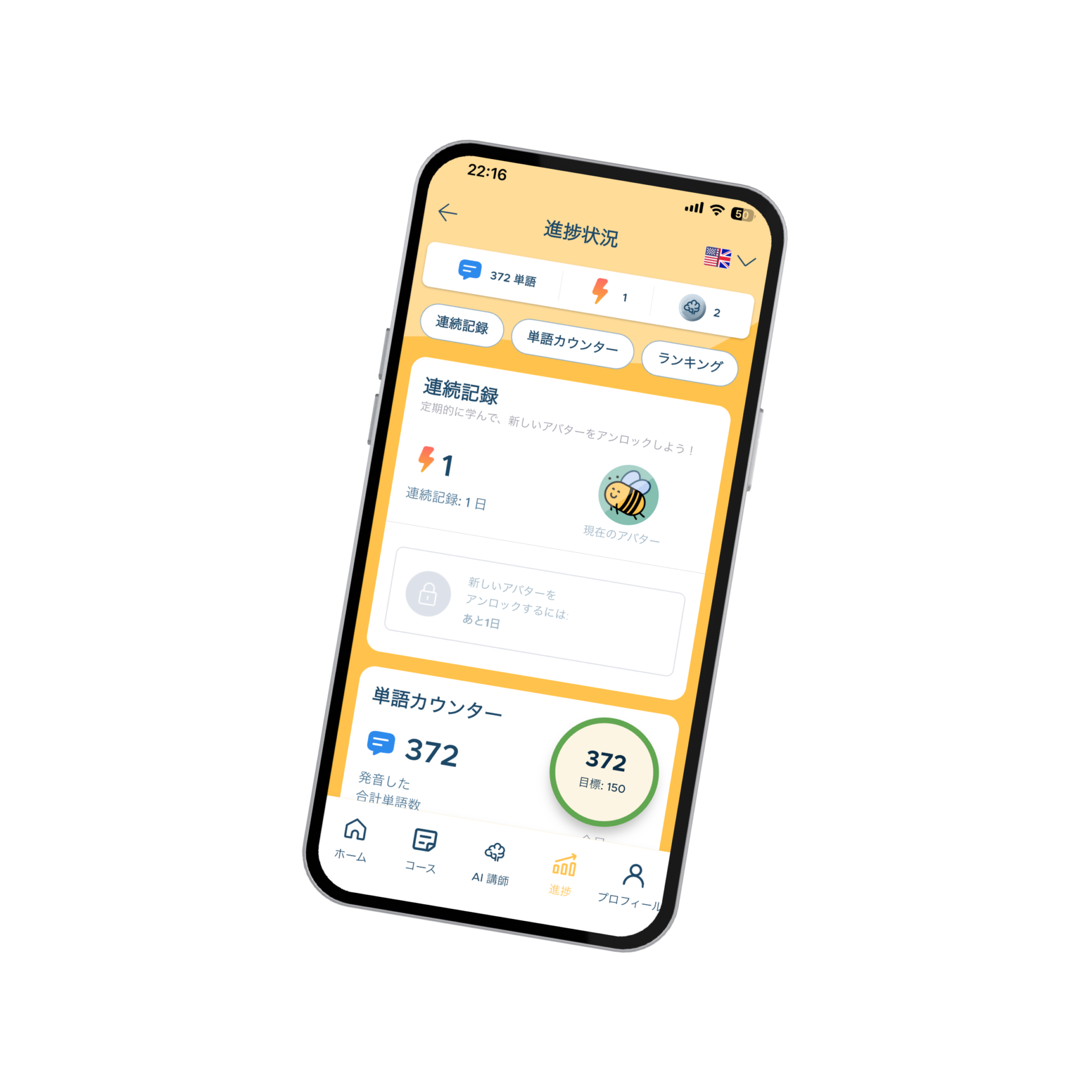
Simply translating a product isn’t enough to win in Japan. You need a design that aligns with local user mental models and a technical foundation that ensures a flawless launch.
As a Certified IT Engineer and Native UX Designer, I specialize in transforming global visions into implementation-ready, high-conversion Japanese interfaces.
I don’t just bridge the gap—I eliminate the friction between your development team and your growth in Japan.
Bilingual (TOEIC 955 / IELTS 7.0) | Nationally Certified IT Engineer
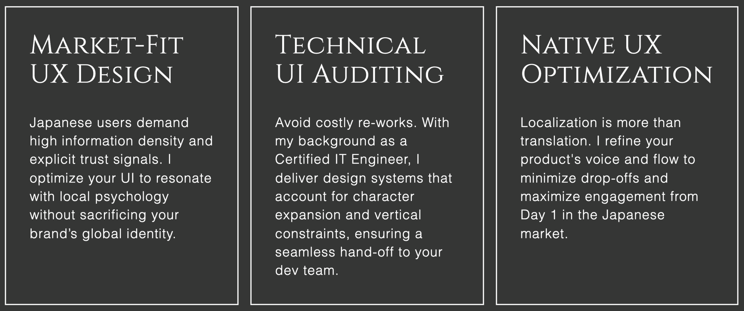
Most designers focus on aesthetics. Most translators focus on words.
I focus on the intersection.
By understanding the underlying code and the cultural nuances, I reduce your development time by 30% and eliminate communication silos between your HQ and the local market.
Google UX Design Professional Certificate
Provider: Google / Coursera
Issued: January 2026

Applied Information Technology Engineer Examination
Provider: Information-technology Promotion Agency, Japan(IPA)
Issued: April 2024
Fandamental Information Technology Engineer Examination
Provider: Information-technology Promotion Agency, Japan(IPA)
Issued: September 2023